Over the course of his life, James Castle worked methodically and privately to produce thousands of pieces of art in a wide range of materials and content. These works reveal an incredible richness to his life, both in images that examine his everyday surroundings and his experiences, as well as those that suggest a deep and complex inner world full of invention and imagination.
Castle was born deaf and never acquired formal language, so he did not talk or write about the thoughts or experiences behind his practice. Even thought many aspects of his art remain unknown, there is so much we can learn by examining individual works in their entirety. Upon closer inspection, each artwork reveals more, providing insights into Castle, his family life, and the material culture of the time in which they lived. Beneath his sooty images and behind the work itself, we find evidence of a daily practice and a day-to-day life, of techniques and habits, of preferences and influences. This exhibition comprises 12 original artworks and 12 facsimiles, allowing both sides of each piece to be viewed simultaneously.
This collection of artworks is part of the generous gift of 61 pieces to the City of Boise from the James Castle Collection and Archive.
Images: City of Boise permanent collection, courtesy of the James Castle Collection and Archive
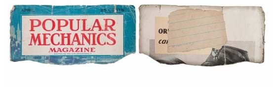
One iteration of Castle's fascination with language is his practice of incising letters from preexisting text, cutting them into pieces, and then reassembling and patching them back into their original location. Castle seemed to be especially interested in specific letters, such as L, A, and S, and he frequently focused on cutting the serifs off those letterforms. The patch visible on the backside of this piece is a scrap of lined notebook paper with faint handwriting in one corner that Castle glued in over a magazine advertisement.
Castle made this drawing of various outbuildings on the family property using his well-known soot and spit technique. He achieved remarkable range in tones by carefully controlling the ratio of soot to spit, and using specific application tools. In this drawing, Castle created the overall toning effect with a mixture of very little soot, and applied it with a wadded paper or cheesecloth. The mixture he created for the opaque and detailed line work contained far more soot, which Castle applied using one of his sharpened sticks, which served as a type of pencil.
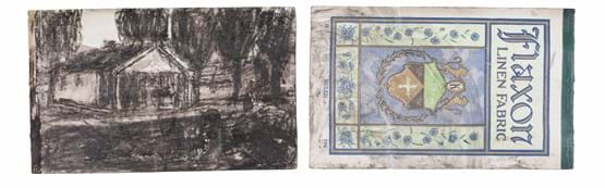
Flaxon brand products included everyday fabrics such as linen, voile, and a lightweight cotton called dimity. These materials were known for being attractive and durable, and they were most commonly used to make clothing.
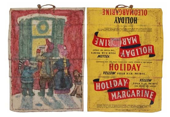
This color rendering of carolers at Christmas is one of many that feature Castle's handmade watercolors, created by leaching color from materials with highly saturated pigments, such as crepe paper or wrapping paper. The string loop at the top of the piece suggests the piece likely hung in the outbuildings on the family farm that Castle used as temporary galleries to display his work.
The margarine package used as the substrate shows a tax stamp, evidence of a law passed in 1886 that placed a 10-cent per pound tax on oleomargarine. The dairy industry successfully lobbied for this law as an attempt to protect butter against the competition from the less expensive margarine.
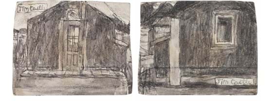
Castle frequently made double-sided drawings, which turned a two-dimensional substrate into a three-dimensional space by showing different views of the same subject.
This drawing shows the shed he used as a private living space and studio from the front and back, giving the viewer a sense of the structure in its entirety.
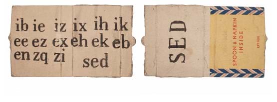
Although Castle did not communicate through speech or writing, he continuously investigated the function of written language. His works use text and suggestions of text to imply paragraphs, sentences, mailing addresses, captions, and names. He created a cast of "authors" to whom he attributed various works of text. Shown here is a piece by one of these authors, Sed, whose name appears on one side below a paragraph of text as one might see on a byline in a magazine. Sed also appears on the back of the work; its orientation changed to better align with the text "Spoon & Napkin Inside."
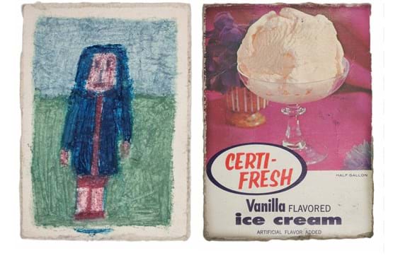
Castle likely used crayons or oil pastels to draw the figure of a girl in this work. These materials create a visibly different look from those in other color works on view. Castle's addition of a small blue line beneath the image may imply a name or caption.
Castle frequently drew on used ice cream cartons--most often vanilla-- to create his color works. Castle carefully cropped the Certi-Fresh label to include the main image and logo, which indicates an awareness of both sides of the work, even though he drew on only one side.
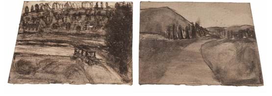
This piece is another example of one of Castle's double-sided drawings, showing two sections of a curving road. The inclusion of a car in one drawing gives the viewer a sense of dynamic activity, bringing the landscape to life.
Calendars likely influenced Castle's frequent use of grid structures. Rather than housing numbers, these grids contained an assortment of images and patterns. The imagery in this grid is challenging to recognize because its orientation is perpendicular to the rest of the piece. By reimagining the orientation, you can discern two panels from a comic-style scene with figures speaking to each other in voice bubbles.
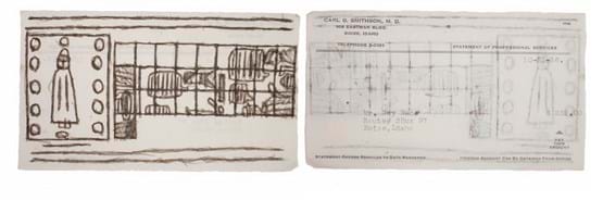
The back of this work reveals a doctor's bill from 1956 for Castle's brother-in-law, Guy Wade. The Route #3 address was the mailing address for this neighborhood through the 1940s. The street name Castle Drive was then used interchangeably with Route #3 until the late 1950's when the name change became permanent. Rural delivery service was a standard for this area up through the 1950s.
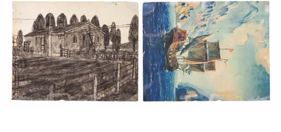
This drawing shows the Castle family home at 5015 Eugene Street during a period in which very few photographs of the property exist. It gives us a glimpse of the site as urban development progressed in the neighborhood, evidenced by the power lines running through the drawing. The ship image on the back of this drawing likely originated from part of a poster or calendar.
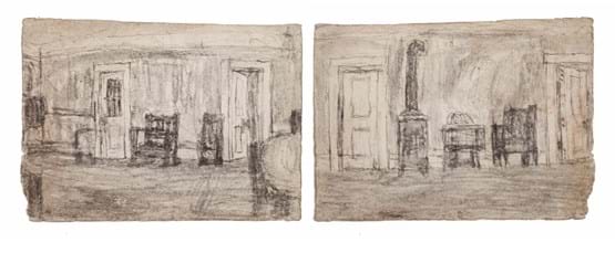
In this piece, Castle again used both sides of the substrate to represent two views of the same subject, placing the viewer in the center of the room, and turning them within it.
This artwork offers a unique glimpse into the interior of the Castle family home. The living room depicted is the same space as the gallery; suggestions of the original interior remain visible in the ceiling and walls today. Notice the square patch in the ceiling on the south side of the gallery, which covers a stovepipe hole. indicating the former location of a wood-burning stove. The two original doors shown in the drawing are still in place in the north wall.
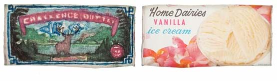
Castle was seemingly fascinated with the Challenge Butter label, since he recreated it numerous times in a wide range of styles and materials. Castle shows a more direct representation in this version with his adherence to the color and compositional details of the original label.
The waxed surfaces of food packaging, such as this ice cream carton, made perfect substrates for Castle's color works because they provided extra tooth to absorb the handmade colors. The carton was cropped perfectly to allow for the entire label to show within the framework of the butter label, which echoes Castle's approach in the double-sided drawings.
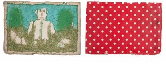
This vibrant color-work shows a lone figure against a striking blue and green landscape made with Castle's handmade colors on a piece of found paper. To prepare this substrate, Castle softened the paper with water and then roughed it up using a stick or razor to give it more tooth. The resulting effect looks similar to that of a high-quality watercolor paper.
